Individual Work
(School Project)
Type
UX Design
UX Research
Service Design
Tools/Software
Sketch
Duration
4 weeks
Fall 2020
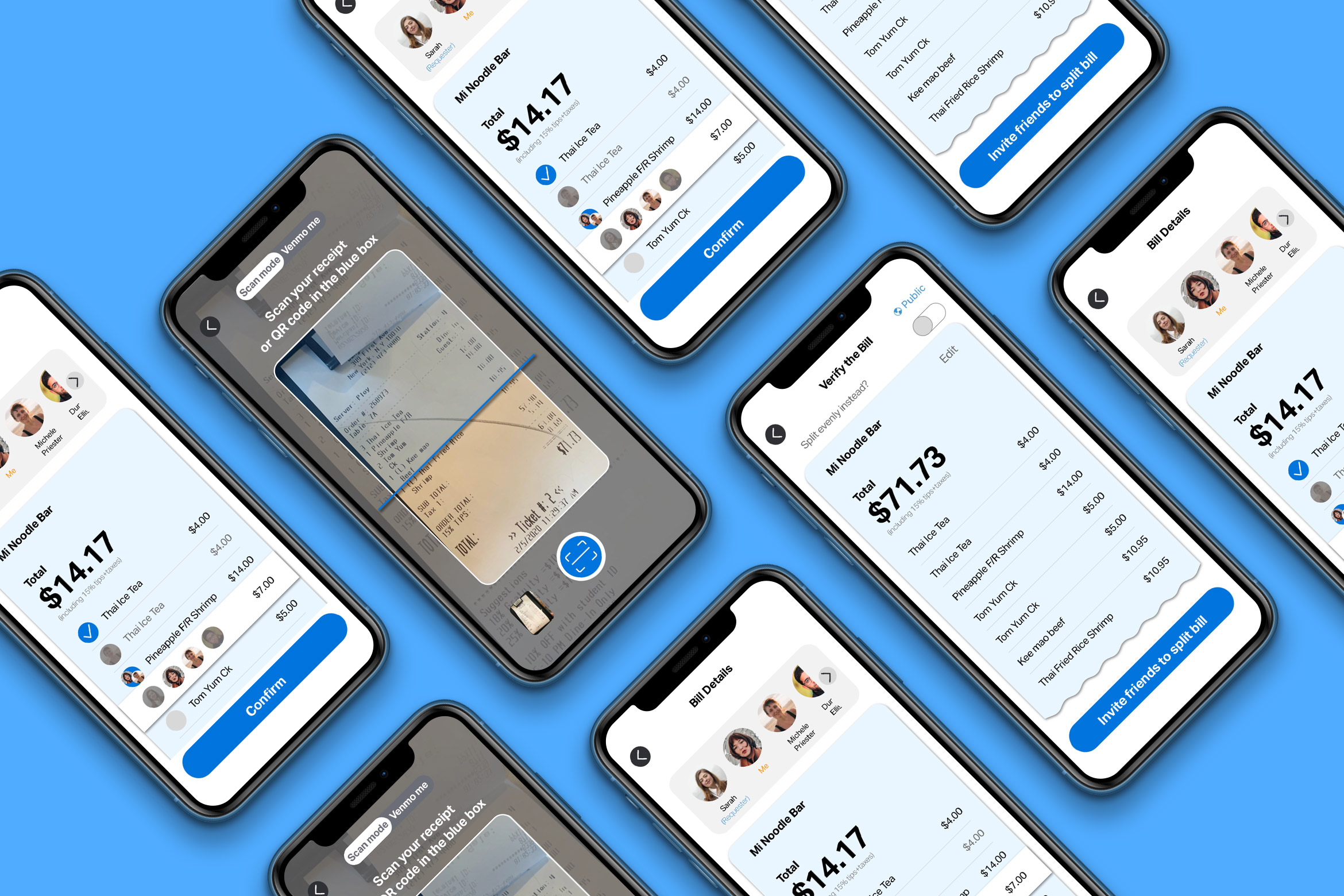
Venmo: A New Scan Feature
This project aims to add a new feature to the existing app to make it more user-friendly. I use the same scan function to identify the receipts and allow users to split bills between each other with different amounts of money.


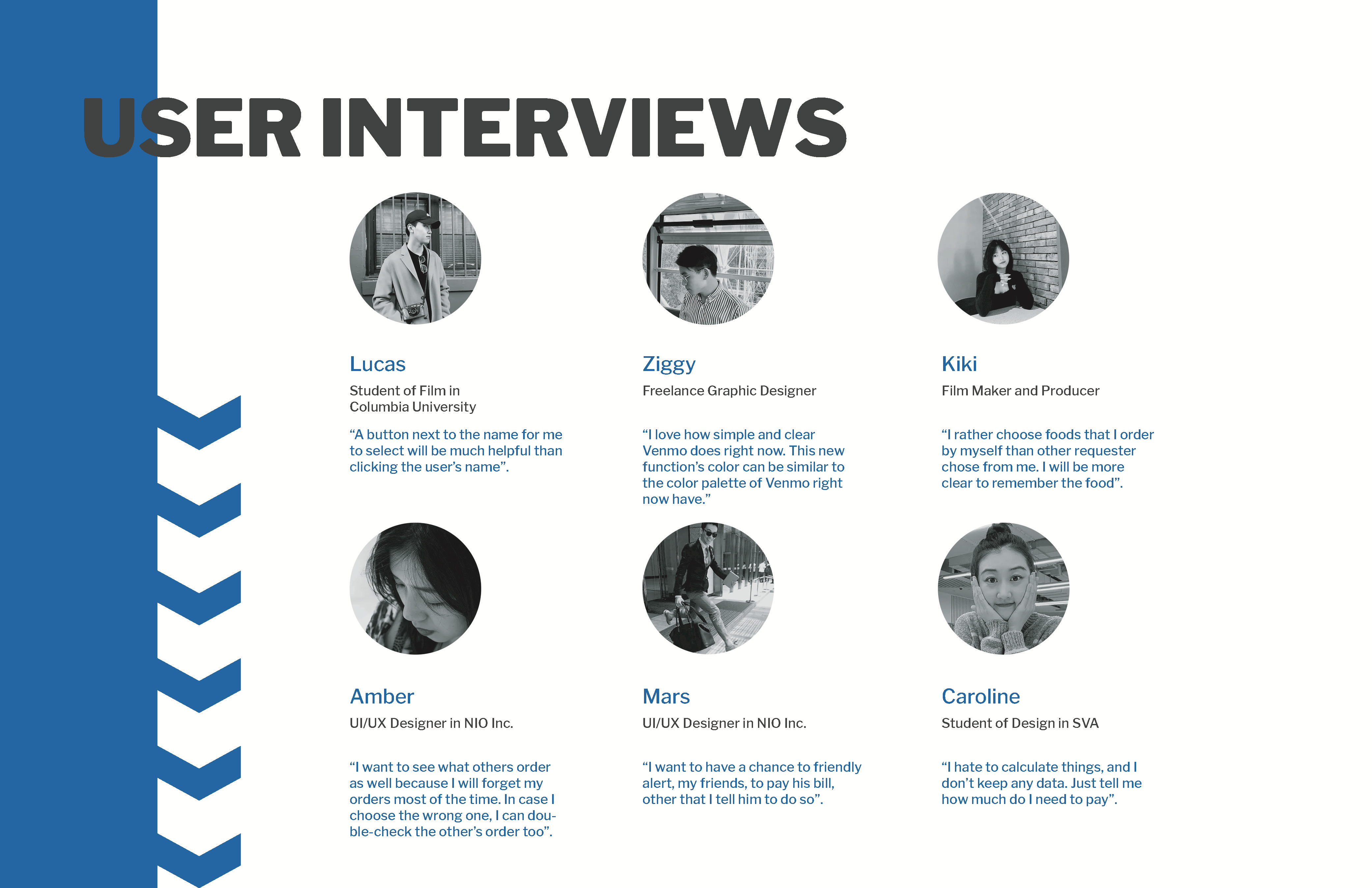
Key insights from the interview

50% of users prefer to see all people's orders to double-checked their choices.
66% of users like to have a simple and straightforward page; no need for any illustrations to decorate.
100% of users love to have timely feedback, such as choosing people.
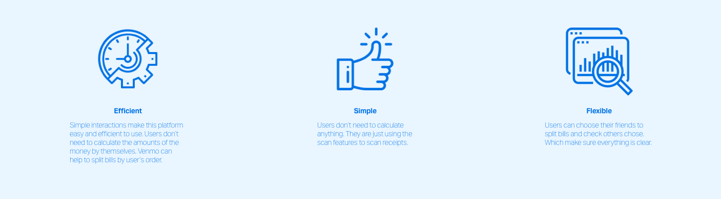
Design Criteria
Design Process
Hand-drawed low-fidelity wireframes + user flow

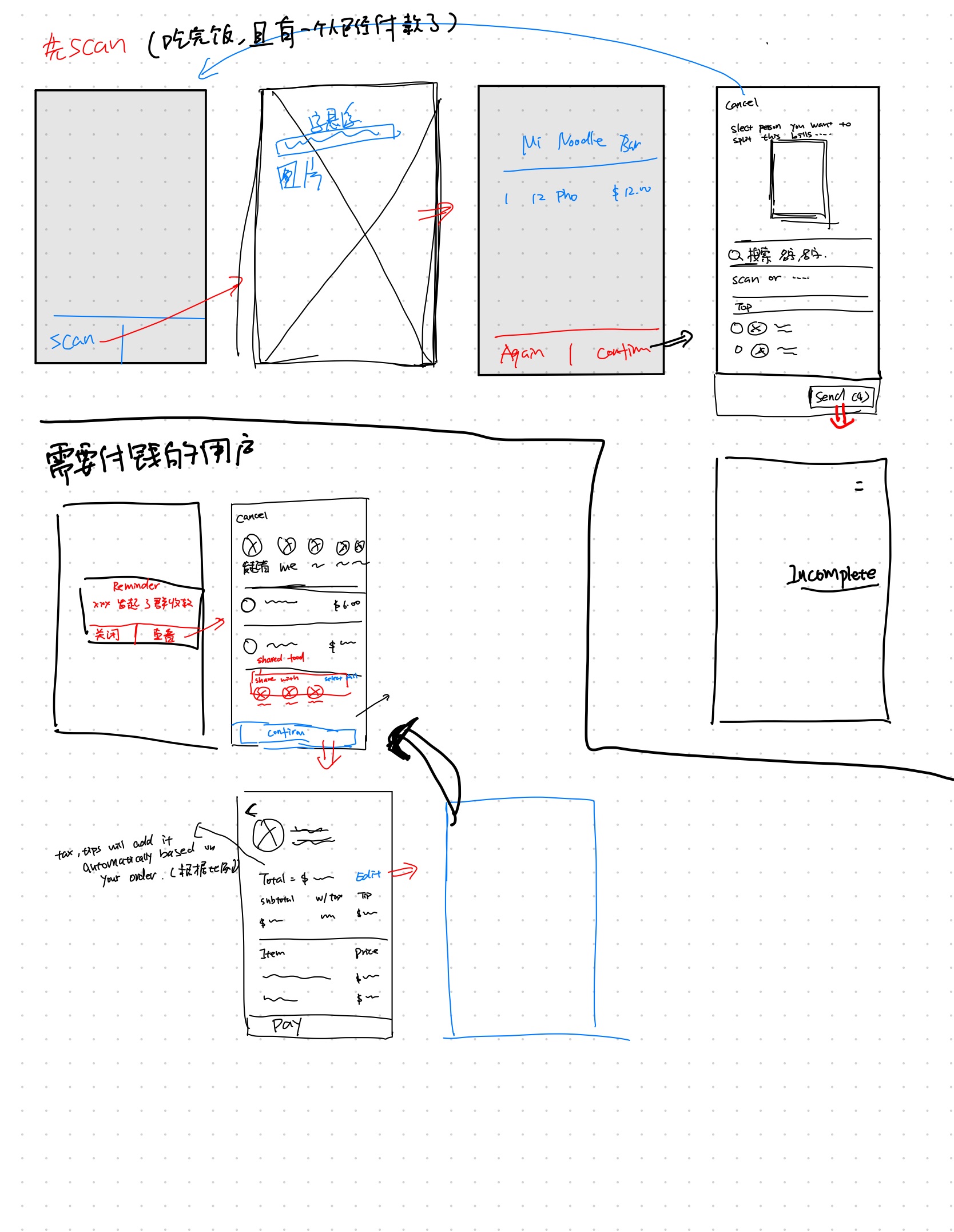
Low-fidelity wireframes![]()

Feedback from first-round of user testing
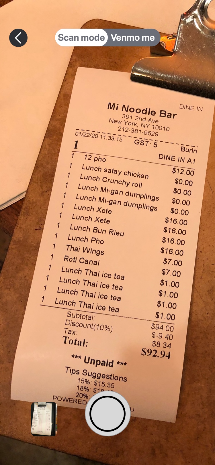
Scan Function
Users are not able to see the scan receipts function directly for the scan interface. Users don't have any instructions to use this new feature.
Based on the user testing, I changed it from left to right by adding scan instructions on the top.

Choosing Friends
Users preferred to see both name and profile image simultaneously if they chose the wrong person.
I add marks on the person's image. In case of users click the wrong person, they do not need to scroll down to uncheck the button. They can directly uncheck it at the top of the page.


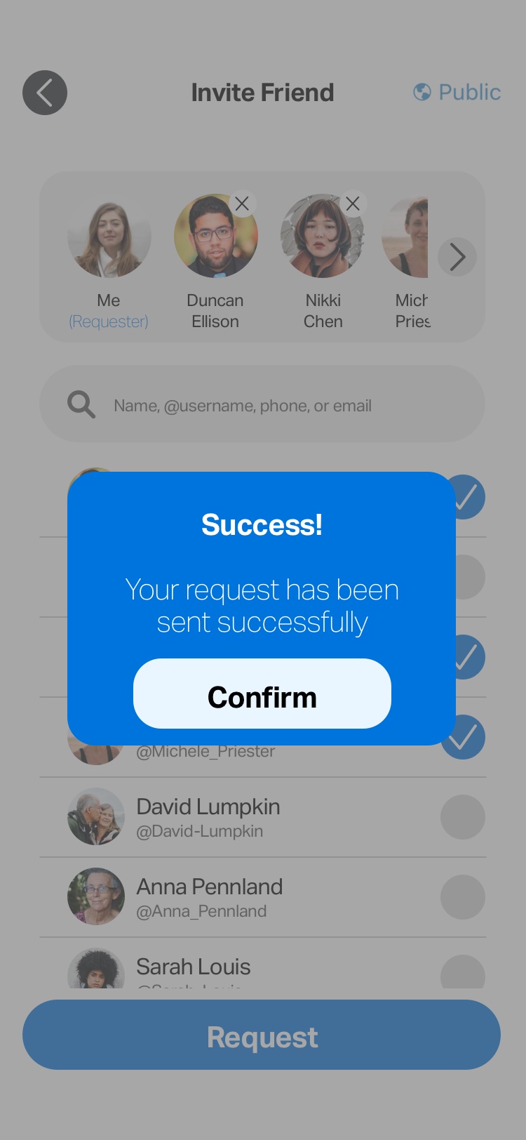
Confirmation Page
Users mentioned that they do not know whether they sent the request successfully or not.
Based on the user test, I added a pop-up confirmation page to notify users that they sent requests successfully, which helps them to have a smoother experience.
Before I do not have this function
High-Fidelity Prototype

